Music: The Geeking
For the benefit of anyone who's interested and who hasn't already had me talk their ears off about this, here's a discussion of the techniques I used to design the music font I've been talking about recently.
I've known for some time that I'm not good at font design. At least, not scalable font design. I was OK at font design back in the 8-
By comparison, scalable fonts give you a terrifying amount of choice. Even once you've decided that you want (say) a curve which has one end meeting this point horizontally and the other meeting that point vertically, there's still an uncountable number of degrees of freedom (in principle) involved in picking a particular curve. You can set down sanity constraints until you're blue in the face –
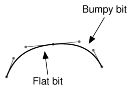
In all my previous efforts to design scalable fonts, this problem has hamstrung me from the word go. I always ended up with my curves looking wrong: a bit too flat here, a bit too sharply curved there, generally uneven. And no matter how I tinkered with the design, I could never seem to produce curves I was happy with –
So this time round, I thought for a while about the problems I'd had in previous attempts. This thinking took me a long way into the rather muddy ground that lies half way between mathematics and aesthetics, but –
The file formats in which digital fonts are stored typically describe the glyphs' outlines using a combination of straight lines (the easy bit) and Bézier curves. Font design tools, therefore, generally follow that lead and provide a convenient user interface for specifying glyph designs in terms of Bézier curves.
My fundamental conclusion, after trying to design fonts using this method and thinking about why I failed, was this: Bézier curves are not a good tool for font design.
They're a good choice for the ‘executable’ form of a font, by which I mean the form that gets fed to rendering engines to actually draw text in the font efficiently. Bézier curves have useful mathematical properties that make them easy to scale, shear and otherwise transform, and they're efficient to render. And they're fully general, in the sense that you can approximate any (reasonably sensible) continuous curve you like with a series of Béziers. So I have no criticism of the fact that all the major scalable font formats (Type 1, TrueType, OpenType) use some variant of Béziers to specify glyph outlines.
It's just that they're not a good way to design an outline, if you haven't already got one you're trying to approximate. The sorts of curves you can achieve easily by dragging Bézier control points around don't map well on to the sorts of curves I find I actually want to produce during font design. Sure, the generality property means that in principle I ought to be able to find a connected series of Bézier curves that's close enough to the Platonic ideal curve I had in my head (if I was lucky) –
So what's wrong with Bézier curves for this purpose?
Well, I think it has to do with the fact that they're parametric. A Bézier curve is specified by imagining a point moving around the plane, in such a way that its x–
Now the thing about cubics –
(Of course you can find Bézier curves that avoid this problem –
To put it another way, Bézier curves concentrate too hard on giving their moving point smooth kinematics with respect to their arbitrary time parameter, when they should instead be giving it smooth kinematics with respect to something that's still visible in the final output –
So this all suggested to me that I'd prefer to be using curves defined in terms of curvature, arc length and intrinsic coordinates (meaning the general idea of defining your curve by imagining you're driving along it at constant speed and changing your direction of travel in ways that are reasonably natural) rather than in terms of some invisible arbitrary parameter.
![]() ptc24 suggested, separately to that, that I should perhaps consider the sorts of motions made when drawing a glyph by hand, and try to find a family of curves that match that reasonably well. So I thought about that too, and it occurred to me that an obviously natural thing to do is to rest the heel of one's hand on the paper while the pen pivots about that point, giving rise to a basically circle-
ptc24 suggested, separately to that, that I should perhaps consider the sorts of motions made when drawing a glyph by hand, and try to find a family of curves that match that reasonably well. So I thought about that too, and it occurred to me that an obviously natural thing to do is to rest the heel of one's hand on the paper while the pen pivots about that point, giving rise to a basically circle-
The conjunction of the idea of spirals and that of curves with simple curvature-
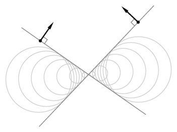
The involute of a circle is a type of spiral which is most easily described by imagining wrapping a piece of thread tightly round your circle, and then unwinding it while keeping the thread taut. The curve traced out by the end of the thread (suppose you tied a little loop at the end of the thread and stuck your pen point through the loop) is an involute.
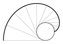
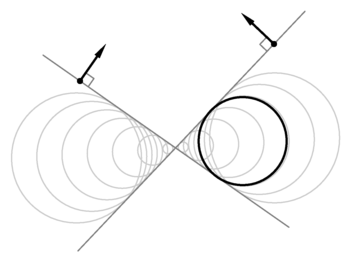
So this clearly has the spirally property I was looking for: if you draw the whole of an involute of a circle, it's a spiral with essentially constant distance between successive turnings. And involutes are indeed naturally expressed in intrinsic coordinates: at any point on the curve, the centre of curvature is the place where the thread currently leaves the circle, and the radius of curvature is equal to the amount of thread you've so far unwrapped, and hence changes at constant speed with respect to the angle of the curve. A further useful property is that actual circular arcs drop out of the construction as a limiting special case (if you let the inner circle shrink to a point).
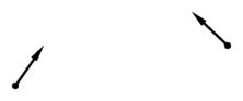
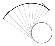
The next question was whether it's sensibly feasible to use involutes as a curve primitive in font design. In order to do that, I'd need a means of treating them similarly to Bézier curves: rather than having to specify them by means of defining a circle and a thread length, I'd want to be able to simply specify two endpoints and some information about what the curve needed to be doing at those endpoints, and have some software automatically find me the right parameters for a segment of involute fulfilling those criteria.
This didn't turn out to be too hard: given two endpoints and a desired direction at each endpoint…
you can draw the normal to the curve at each end…
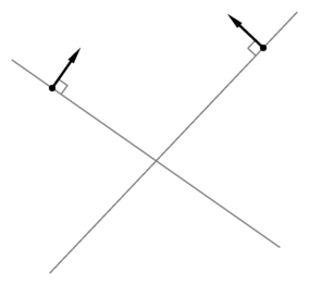
… and then both those normals have to be tangent to the inner circle.
So it's just a matter of picking the circle's radius such that the distance round its circumference is equal to the difference between the distances from each curve endpoint to the corresponding circle tangent point, which turns out to be a nice easy linear equation.
Then you can draw your involute.
Having worked all that out, I implemented it in a small curve-
The results were good –
In other words, I had achieved precisely what I set out to: I had found a family of curves which greatly reduced the number of degrees of freedom I needed to get just right, and yet which still contained nearly all the sorts of curve that I actually wanted to end up with. All I lost was a large number of opportunities to make errors.
And that's the basis on which nearly all the glyphs in my music font are defined. Typically a chain of involute segments (and a few straight lines, and just occasionally a Bézier turned out to be the right tool after all for some particular job) is used to define the centreline of a stroke, and then I hand-
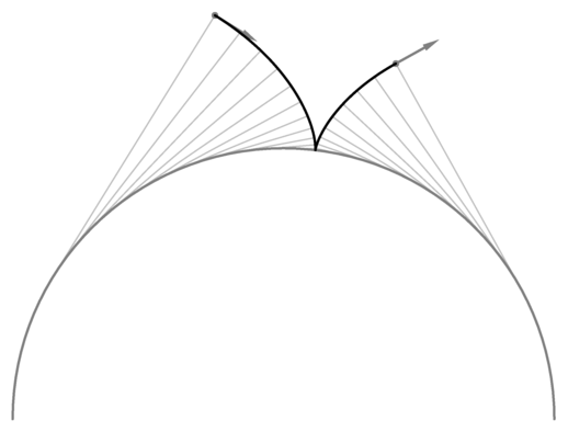
There are still a few caveats when using involutes in this way. For a start, the procedure I described above for picking an involute given two endpoints and direction vectors doesn't guarantee to produce a sensible smooth curve. One failure mode is that the thread being wrapped around the circle might pass through zero length in the middle of the curve and go negative –
If this happens, you just have to try specifying your curve in a different way, or use more segments, or (if you really have no alternative) resort to a Bézier.
Also, being fundamentally based on circles and curvature, involutes aren't as agnostic about aspect ratio as Béziers. They do very well at drawing shapes that are essentially ‘circle-
no subject
I definitely came at it from the art end not the maths end!!
no subject
no subject
So what I'd do is sketch lightly in pencil the shape, it'd be a bit wrong, so I'd correct and correct and correct with the pencil finally firming up the Right shape with a heavier pencil stroke. Much quicker than trying to do the same on the computer, but still doesn't require perfected mind to hand skills...
If you can see where the bump is on the computer and correct you can do that on paper, it make take many iterations to find the 'right one' but iterations are much quicker with a few pencil strokes on paper than point click stretch move/insert data for each iteration of finding the curve on the computer....
A pencil sketch on a grid can help computer transfer too (though more relevant for improving 'by eye' than the scan onto a different layer and trace option, I routinely sketch over grids on paper to improve putting curves directly on my curve unfriendly cad program)...
I guess the problem with scan and trace, rather than computer by eye or sketch then transfer to computer by eye is there are extra stages in scanning and tracing and fixing the trace.. whereas going straight for by eye with computer curves does it in one - but only if you're good enough!
Hi Simon
This is interesting. I very much love your go-at-it-with-a-clean-slate manner. I deeply respect that in anyone in any discipline or endeavor.
Buckminster Fuller comes to mind.
I'm an illustrator who is far more right-brained than left, and respect math in that way. (So, Fuller's writing in his works strikes me as much as poetry as everything else it is.) I came to math from learning to draft in perspective, thanks to Howard J. Ashley's book, 'Accurate Perspective Simplified'. ex:
http://zuma.vip.warped.com/acs/acs-p27.jpg
That book was my only exposure to trigonometry in any formal sense.
Reading here -Well, I still have yet to consume and digest it all -touches on many things I could go on about, fontmaking in the least. (Recently, and still, I have yet to fully commit myself to leaving hand lettering behind and go full on with truetype fonts. I tried making my own at http://yourfont.com but found that was just a learning endeavor and would need to do it again, perhaps several times, before I got anything usable.)
I've explored my inner geek some years quite well but nowhere near your level. I love and miss 16 bit computers. With the advent of 32 bit computers and their differences, plus needing to focus on my central art and writing endeavors, I've left that behind sadly. As has so many. I'm glad to see someone like yourself who hasn't.
I suspect my works and their perspective couldn't be further from your interests, deeply rooted in psychedelia and psychotropic modes of cognitive experiences and works as they are, so this will likely be the longest comment I may ever make here. I'm definitely adding you though, and with great respect and encouragement.
My only direct comment on the circular approach is that it brings Fuller's spherical trigonometry to mind, that he derived to solve what I believe may have been a similar problem. I could be wildly wrong though, ignorant as I am. -The Golden Section too comes to mind, but hardly applicably.
I have to get back to work but in the future will be backreading in your LJ with relish, I am sure.
best regards
John Farwell
Oklahoma City, Oklahoma
no subject
no subject
no subject
no subject
Another vague idea I had was to try involutes of things other than circles; in particular, I had an idea that using involute segments of ellipses would add another degree of freedom which might enable me to match up the curvature as well as the direction where two segments met. Again, though, the maths would have been a lot more fiddly (elliptic integrals, yuck), so I held the idea in reserve for use only if it became necessary.
no subject
One notable difference in methodology between us is that he seems to like to draw his font outline the same way the eventual format specifies it, i.e. outlining the filled area so that you have to trace along both edges of a stroke. One of my first decisions was to avoid that (except, as usual, in cases where it turned out to be the right thing after all :-) in favour of using a single curve to define the centre line of the stroke and then separately specifying a varying nib. Doing it my way, it's easy to draw crossing lines (such as in the treble clef) and be confident that the portions of a stroke on each side of the other will line up as if they were two parts of the same sensible-looking curve, because they are. Doing it his way, you have to get that right by eye. Also, even in the absence of crossing strokes, I found it difficult to draw two nearly-parallel curves in a way that made them vary from parallelness just right with respect to each other.
Then again, I've looked at some of his actual font designs, and they seem to have stroke widths which vary more subtly than mine in a way that looks deliberate, so it seems entirely plausible to me that his method is better suited to his level of skill while mine is better suited to mine!
Still, all very impressive, and I'll probably finish reading his thesis at some point in the near future. Just a shame he decided to apply for patents.
no subject
no subject
When I wrote an airfoil simulator for engineering, I used cardinal splines to make the shape between control points (which I think wouldn't work as nicely as this for fonts).
no subject
Spiro?
no subject
no subject
(Anonymous) 2010-05-13 07:48 am (UTC)(link)