![[personal profile]](https://www.dreamwidth.org/img/silk/identity/user.png) simont simont |
Mon 2009-09-28 18:12 |
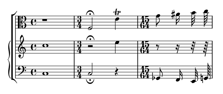
| OK. Here's a pair of demo images that show off all the clefs, note heads, note tails, ordinary accidentals and a few other things: 

First one is standard Lilypond; second one is mine. Things I specifically disliked about LP and prefer about mine include the treble clef (LP's is absurdly tall by the standards of most others, the curved line down the middle makes it look as if it's leaning backwards, and a couple of parts are rather unevenly curved); the trill (LP's is unpleasantly ornate, mine is more in the style I was used to from music I actually played); the time signature digits (IMO much more readable if they're small enough not to collide with the outer stave lines, though actually making them miss at both ends turned out to take some cheating!); the sharp (LP's is too wide and also too slanted for my taste); the fermata (mine looks like an arc of a circle whereas LP's non-vertical ends make it look oddly parabolic); the quaver tails (some differences between the down and up tails are a good thing, but I think LP takes it a bit far). And if you look very closely, LP's minim head has a knobbly outline, but it isn't really clear at this resolution. Most importantly, I find I can read my version without the notation jumping out at me: I find it does a better job of fading into the background. Standard LP looks like strangely stylised music, whereas mine just looks (to me) like music. |
|